Home
Images
Vectors
Videos
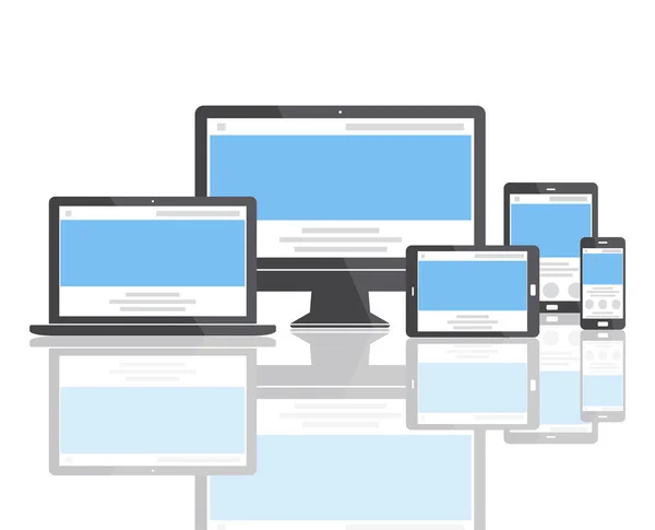
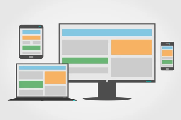
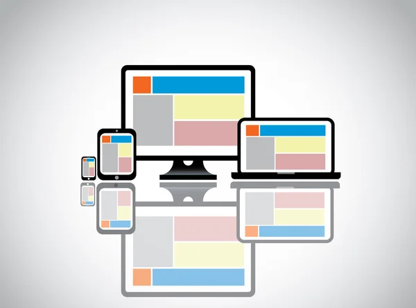
Stock image Responsive web design layout on different devices. Set on dark b
Published:
May.07, 2015 13:18:46
Author:
simpson33
Views:
45
Downloads:
0
File type:
image
/
jpg
File size:
7 MB
Orginal size:
6470
x
4286
px
Available sizes:
S
(500 x 331)
M
(1000 x 662)
L
(2000 x 1325)
XL
(6470 x 4286)
EL0
(6470 x 4286)
Level:
silver
Download Image
Image topics:
Background
View
Design
Set
Liquid
Technology
Dark
Photo
Symbol
Text
Display
Phone
Screen
Touch
Monitor
Pc
Desktop
Internet
Scale
Web
Template
Grid
Page
Website
Layout
Tablet
Site
Block
Media
Different
Size
Column
Interface
Multimedia
User
Content
Scalable
Proportional
Usability
Responsive
Smart Phone
Similar stock images
Responsive Web Design Layout On Different Devices. Set On Dark B
6470 × 4286
Responsive Web Design Layout On Different Devices. Set On Dark B
6470 × 4286
Set Of Display, Tablet And Mobile Phones Electronic Device Icons, Isolated Outline On A Light Background Stylish Vector Illustration EPS10
5208 × 4167
Realistic Device Flat Icons: Smartphone, Tablet, Laptop And Desktop Computer. Vector Illustration On Gray Background
7000 × 4000
Web Design Template Digital Devices
7192 × 5820
Adaptive And Responsive Web Design Icon Set
5556 × 3712
Website Template On Desktop Computer Laptop Tablet & Smart Phone. Web Concept Design Illustration Of Colorful Compatible Website On Different Devices Displaying Company Information To Customers
6479 × 4815
Responsive Web Design Gadgets Over White
5000 × 5000